
The Chiller
Tuesday, 6 March 2012
Post Audience Feedback
There are 3 main way we recieved feed back for are 3 media text.
Private viewing
two days before we completed the work, myself and another member of my team invited one person each to come and give some positive cristism before we submitted the work. The viewing happened in the media suite and we showed all 3 media pieces.
Are feed back was...

Georgina kleatheous 19
'the title needs to be a bit clearer, i had to squint to see it'
'the music cut off a bit to early at the end of the trailer'
'the posters really detailed so you need to add a lot the the magazine cover'

Marianne Hakeem 18
'Add something more to text in the trailer, it looks a bit boring in comparison to
your other shots'
' Sort the volume of the music out, it tends to dip throughout the trailer'
Screening
We explained and showed are work to 30+ viewer of a mixed age range to get their feed back, we produced an invitation and a questionnaire as a quick and simple way to gain feed back
.png)

.png)


Private viewing
two days before we completed the work, myself and another member of my team invited one person each to come and give some positive cristism before we submitted the work. The viewing happened in the media suite and we showed all 3 media pieces.
Are feed back was...
Georgina kleatheous 19
'the title needs to be a bit clearer, i had to squint to see it'
'the music cut off a bit to early at the end of the trailer'
'the posters really detailed so you need to add a lot the the magazine cover'

Marianne Hakeem 18
'Add something more to text in the trailer, it looks a bit boring in comparison to
your other shots'
' Sort the volume of the music out, it tends to dip throughout the trailer'
Screening
We explained and showed are work to 30+ viewer of a mixed age range to get their feed back, we produced an invitation and a questionnaire as a quick and simple way to gain feed back

.png)


.png)


From this feed back it is clear that the combination between all 3 products is clear and consistent as all respondents said that they either agree or strongly agree, this is important as these media products are a promotional tool and therefor have to be recognizable. As it is a promotional tool the response the question referring to whether the trailer makes you want to watch the film is also important, the majority people said yes it did, however 11% said they were unsure, many said this was because they found the trailer a bit confusing.
Some other responses
- "I would give away more in the trailer- to draw the people in."
- " did not like the music"
- "everything was well presented and displayed"
- "emphasise darkness e.g. its something scary so use darker colours to emphasise evil/infection."
- "well made trailer
Youtube
We uploaded are trailer on to youtube and recieved feed back from a feature film producer and directer called Mike Roll.

Monday, 20 February 2012
Promotional Poster
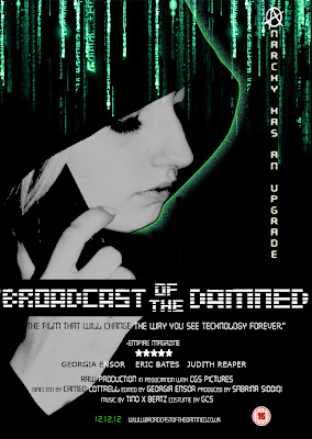
Are initial idea for the film poster was to use/mimic the poster of diary of the dead, using are protagonist in the for ground with other 'infected' rioters in the background, we were going to set this in Croydon to add location to are cover. however it quickly became clear that although this idea was relevant to are piece it did not portray the main focus of technology, therefore we decided to move away from this idea.

So to stay along the lines technology we looked into more technological films such as matrix and the happening, after some research we came up with the idea of placing of using decoding, almost as if its blood dripping down the top. The use of this decoding quickly became a theme used throughout of coursework.

In the end we decided to used a combination of both poster, we used the idea for are title from diary of the dead, also having are protagonist on the poster, but we also used the matrix decoding with are strap line dripping down aswell.

Sunday, 19 February 2012
Magazine Front Cover
We decided to use empire magazine as our magazine of choice as it has the largest circulation, so it will therefore reach a wider possible consumer base. Are film is targeted toward 15-30 yrs olds, the younger half of are audience would probably not purchase a film magazine however it is easier to target them through social media and the development of web 2.0. Where as the more expensive magazine marketing is focused on the older range and they are likely to spend more on the product.
 The joker was the main inspiration for the are front cover, it was a horror that followed are colour scheme, and as a group we all liked the overall look of the cover. Empire magazine very rarely changes there masthead, they only change from there iconic red for special edition cover, therefore we decided to make are edition a special edition and followed this idea throughout the teasers on the are cover.


The latest edition of empire magazine, february 2012 was also quite bare, so we decided not to over clutter are page with to many teaser, instead keeping it quite neat and clean. We did not leave it as empty as the February edition as we still wanted to stick to the traditional magazine conventions.
On the cover of another film magazine Total Film, the use of the centralised 'v' really stood out and caught are attention. So we developed the idea of including the Anarchy sign that is used during the trailer and on the poster.

This is the final product, we used a centralized image that reflects the image used on the joker cover, we also used are protagonist Danni to star on the cover. The magazine is also consistent with are use of digital sf text and are colour scheme of green, white and black.
Sunday, 5 February 2012
Costume for the Protagonist
 |


The use of the 'hoody' is a symbol of crime and youth to the older generation. however we dressed Danni in a grey almost white hoody to show that shes still young and could lead the life of crime but also to show that she still innocent. the logo on the hoddy is also quite ironic.
Subscribe to:
Comments (Atom)